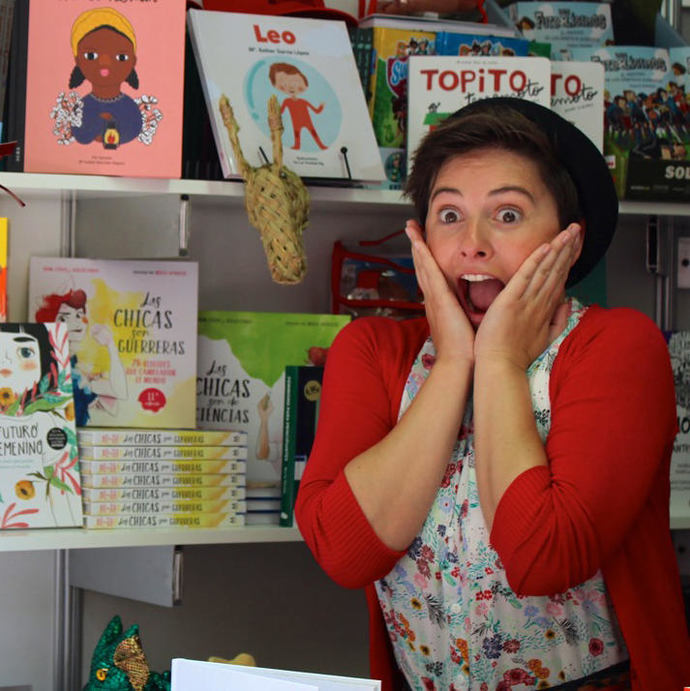
Bologna Children’s Book fair is a great occasion to meet new friends and reunite with old ones. One of our most singular moments was our encounter with Raquel Bonita (Gijon, 1984), the illustrator behind CCBF 2019 visual identity. Although we had been in touch with her for a while by email, there is nothing like putting a face and a voice behind a name.
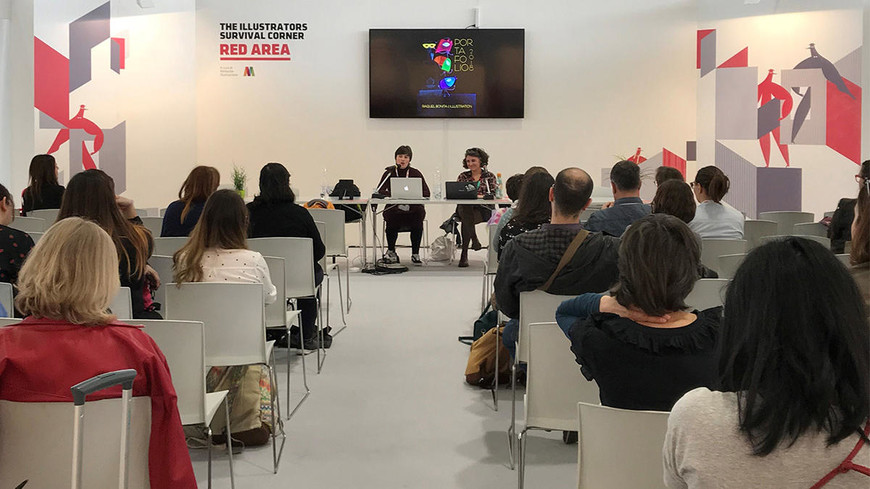
Raquel was quite excited to see her illustrations all around the book fair, on the advertisement billboards and at the CCBF booth. After a fun photo session, we sat down to know more about her life and her illustrations… CCBF also invited Raquel to hold an event on her work at the BCBF Illustrators Survival Corner on Wednesday 3 April. If you couldn’t attend, here are some of the things we talked about…

CCBF: You are a very eclectic illustrator in terms of styles and techniques. Unlike other works visible in your online portfolio, you chose a very graphic and geometric style for Todos Menos Uno. What led you to this stylistic decision?
Raquel: It is true that sometimes I can be a bit eclectic. Maybe it is because I like many things and styles, and I like to play with them. In addition, I think each book calls for a unique way to work. Maybe I think this way because I come from the advertising world where you have to be adaptable and change everything for each project. For the artworks I made for the key visual, I would stay that the style “chose me” while I was playing with the idea of drawing with the minimum possible lines and shapes. At first, it was a procrastination game, but at the end I liked the funny result and I followed the way to know where I could get.
CCBF: Could you talk about the creative process of Todos menos uno, the artwork that earned you a Special Mention in the Golden Pinwheel Competition last year? What brought you to this story? Was the creative process fluid?
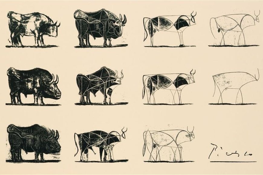
Three years ago I was participating in a workshop with the illustrator Miguel Tanco. In one of the materials that he gave us there was the image of “Bull” from Pablo Picasso (seven lithographs where Picasso visually dissects the image of a bull to discover its essence).

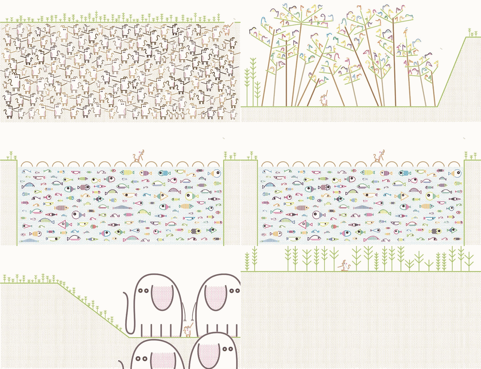
I liked that game, so I started to sketch different animals trying to find their essence in just a few lines. It was just a game, but at the end I liked the result and I decided to create a story. The creative process was not as fluid as in other projects. This book is very personal and different from others I have made, so it took me more time since I started to work until the final version. It took me two years. In fact in the beginning I was thinking about a "look and find" book, but then a story centered on a little mole appeared. The most difficult part was to find the right words to resume the essence the full meaning of the story or at less give the clues to the reader to complete the meaning—the full text only has around 30 words. I showed the story to different 2 and 3 year-old children and it is incredible how they managed to challenge the visual narrative much more successfully than adults.

CCBF: Do the illustrations of the new key visual also tell a story? Is there a theme behind it?
Well, I think any illustration tells a story. One of the things I have learnt about the definition of illustration is that a good illustration should be its own narration. So I always try that all my illustrations tell something. In our case, I think that three curious little tigers have lots of adventures to live and the reader can imagine lots of stories with these characters. As the illustrations were for a children’s book fair key visual, I wanted to represent children’s curiosity and play as the two most important forces in children’s literature.
I have not thought about a title for the key visual. In Spain we have a tongue twister which says: Tres tristes tigres... (Three sad tigers). In this case these little tigers are not sad at all. So maybe we can title the key visual as Three Naughty Tigers!
CCBF: Was it your first time you were asked to make a visual identity project?
Can you introduce briefly how you proceeded? Was there a lot of communication involved with Boiler design studio? How did you choose the animals? the colours? the shapes?
It was not my first visual identity project but I could say that it has been the most important and funny key visual I have illustrated until now. The process was really easy with the studio because the creative briefing they gave me was really clear and precise: that is one of the most important things to work in that kind of projects. I made three versions of the illustrations but since the beginning the work was a lot of fun. I chose the tigers because the cubs are sweet, brave and curious as any “human cub”. Regarding colours and shapes, the design team had a precise idea about what they needed so it was easy to decide this kind of details.
CCBF: You had several jobs in advertisement and graphic design before switching to book illustration. What made you develop such a strong interest in children’s book illustration?
Although I studied and was specialised in art direction and illustration I worked as account manager most of the time I worked in advertising. I liked my job but I missed the creative side of it. When I studied illustration I decided to take part in a children’s book contest with another writer, we won the second prize and it motivated us to start a new project about tales and illustration. We crossed that door in 2010 and I fell in love with the amazing world of picture books. So in the end I decided to focus on children’s book illustration because I realised that it is one of the things that make me really happy.
CCBF: You also worked as a publisher for a few years? How was it to edit books (was it only your own books?)? What can you tell us about this experience?
I decided to create a children’s literature blog along with the writer whom with I won the children’s book contest. Every week we published a tale with an original illustration. After 2 years we had more than 100 tales so we decided to create a book. We published our books for 5 years but it was really hard work and in the end I had not enough time to illustrate and write. In addition my partner went to Germany to live and I went to England so we decided to stop the publishing adventure. But that experience gave me a good perspective about the market and how this world works. I realised the importance of a good publisher and how hard they work for each project. It was a great experience because I started to have a really good network of librarians, bookshops, publishers, critics and other authors and lots of them are now really good friends.
CCBF: How did you learn about the Golden Pinwheel Young Illustrator Competition?How do you feel about your great achievement performance in the competition? Why do you think taking part in such competitions can be important?
I feel really surprised even until now. All those years I have learnt that the most common answer that an author receives is “No, we are not interested”. You have to live with that trying not feel that those rejection emails aren’t personal or mean that you work is not good enough. It is obvious that you have to be very critic with your own work but you have to deal with that hard part of the profession. I know that the books I want to do are different and it is a little bit difficult to find publisher, for that reason, last year I wanted to present my work to the Golden Pinwheel Young Illustration Competition. It was a way to test if my work was interesting enough. I knew that it was very difficult to be selected. Lots and lots of amazing illustrators take part in this competition, for that reason I was over the moon when I read my name as finalist. And when Adolfo Serra (a Spanish artist who was in Shanghai attending CCBF in November) told me that I had received the Special Mention, I could not believe it. This recognition has been really important for me, as it helped me realise that I am on the right track and my projects deserve the effort. In addition, I think Shanghai Children’s Book Fair is one of the most important fairs of children’s literature at the moment, and this international visibility is such a great opportunity for any illustrator.
CCBF: What is next your next project? Any new exciting idea you would like to tell us about?
My new book is going to be published in Spain with Bookolia this autumn and I am working in an amazing and really funny new book for an English publisher that it is going to be launch in spring 2020. But I cannot tell any more at the moment. Stay tuned!
Raquel Bonita is the pen name of Raquel Blázquez (Gijón, 1984), an illustrator from Northern Spain now based in the United Kigdom. Raquel graduated in advertising and public relations before developing an interest in the artistic field. She studied art direction and web design at CICE and attended the Madrid School of Professional Illustration (ESDIP). She won the 2nd Prize in the XII Badajoz Illustrated Stories Award (children’s book category) when she was still a student. This early achievement encouraged her to focus on children’s illustration and, since then, she has worked for several Spanish publishers, including Combel and Édébé.
One of her latest works “All But One” earned her a Special Mention in the 2018 Golden Pinwheel Young Illustrators Competition organised by CCBF; it was also shortlisted for the 2018 Nami Concours later that year.
Every year, CCBF selects one illustrator awarded in the Golden Pinwheel Young Illustrators Competition to create the fair’s next annual key visual—this is one of the many ways the competition offers to enhance young illustrators visibility and career opportunities. The 2019 Golden Pinwheel Young Illustrators Competition is now open to entries.


